

Branding Systems
Campaign
Visual Merchandising
Strategy
Social Media
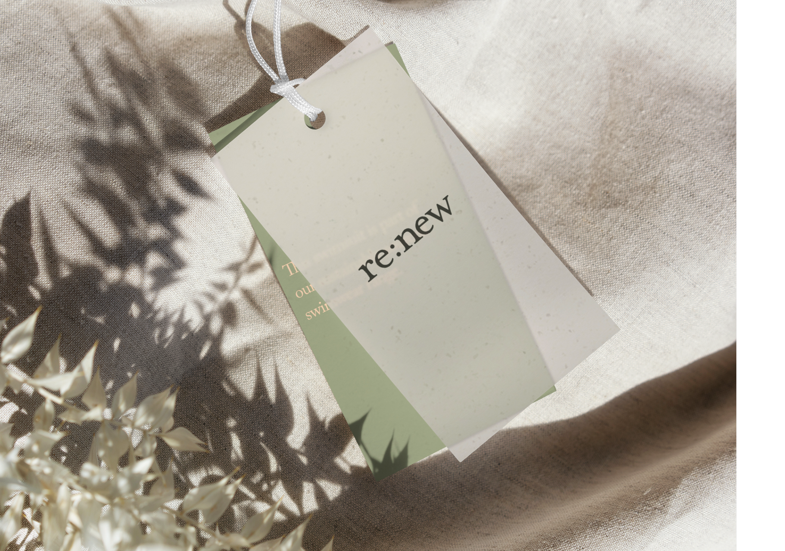
Label Design
OOO Advertising
Sunseeker Re:new & David Jones
Visual Identity & Campaign
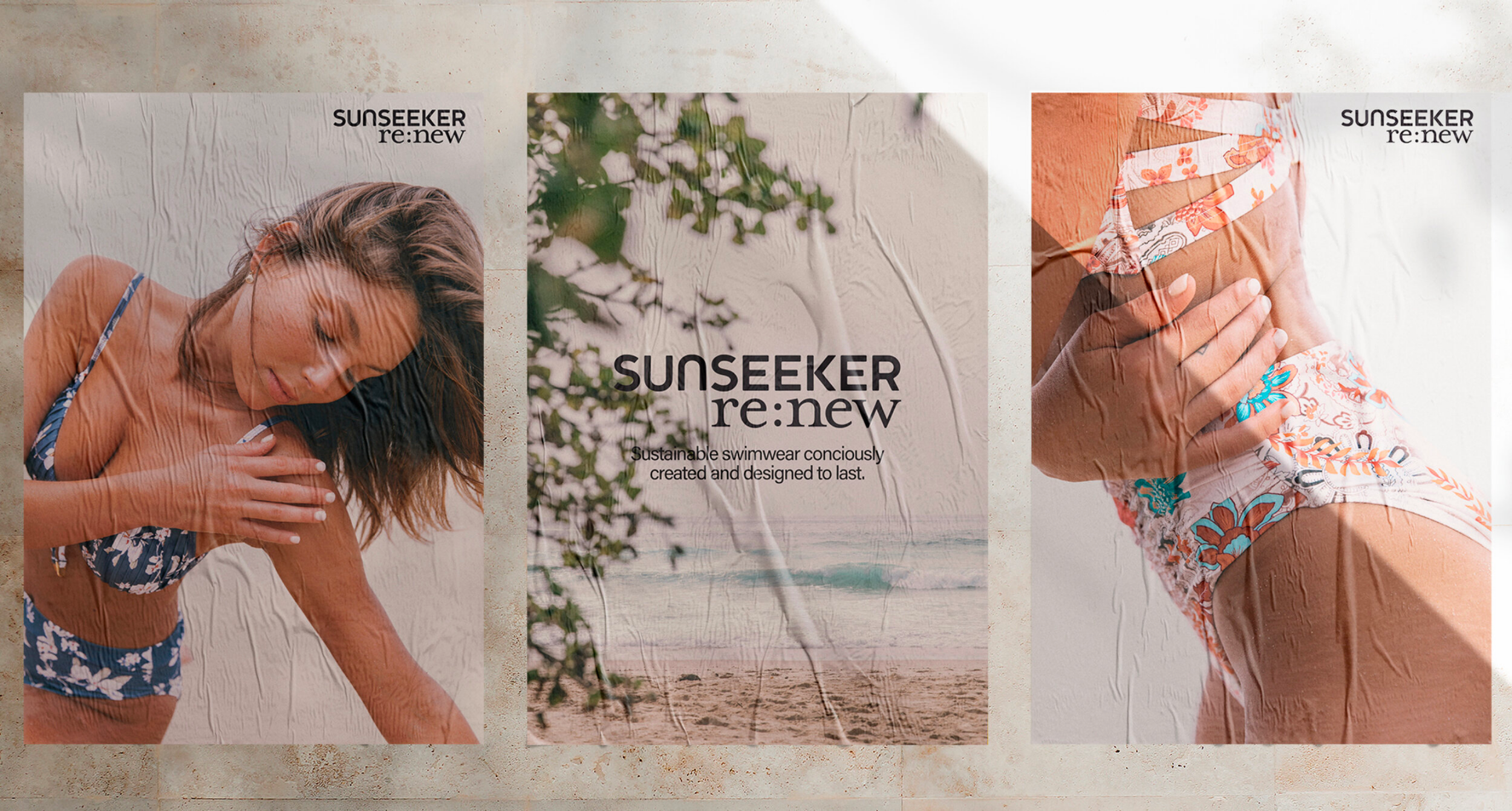
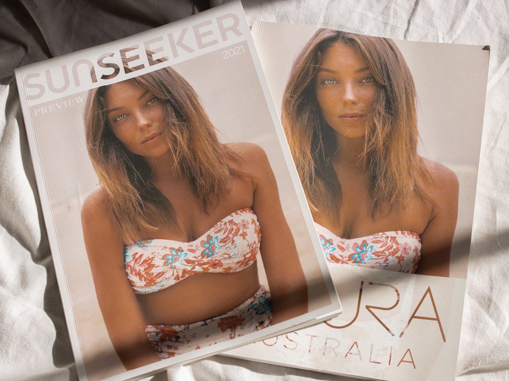
This project is broken into two sections. Firstly, is the creation of the visual identity for their sustainability brand Sunseeker Re:new. It contains earthy muted tones, fashion-centered typography, feminine imagery and light icons.
The second part of this project was designing a suite of collateral to be used for OOO advertising and visual merchandise in a collaboration with David Jones to be distributed nationally throughout Australia.
-
Both projects began with R&D.
Visual Identity
The visual identity for Re:new started with looking into how the fabric itself was made, the concept of ‘repurposing’, and current trending insights into the swimwear industry. At the time sustainable swimwear was the hottest topic - so I carefully decided to put ‘RE:’, to reflect the constant communication and pay homage to the ‘responding’ factor used within emails. The logo also needed to co-exist with the current Sunseeker logo, and through using the status quo of combining a serif and sans serif, Caslon Pro was chosen.
The palette was chosen on the colours we see on a sunny beach day, through a sepia-toned pair of sunglasses.
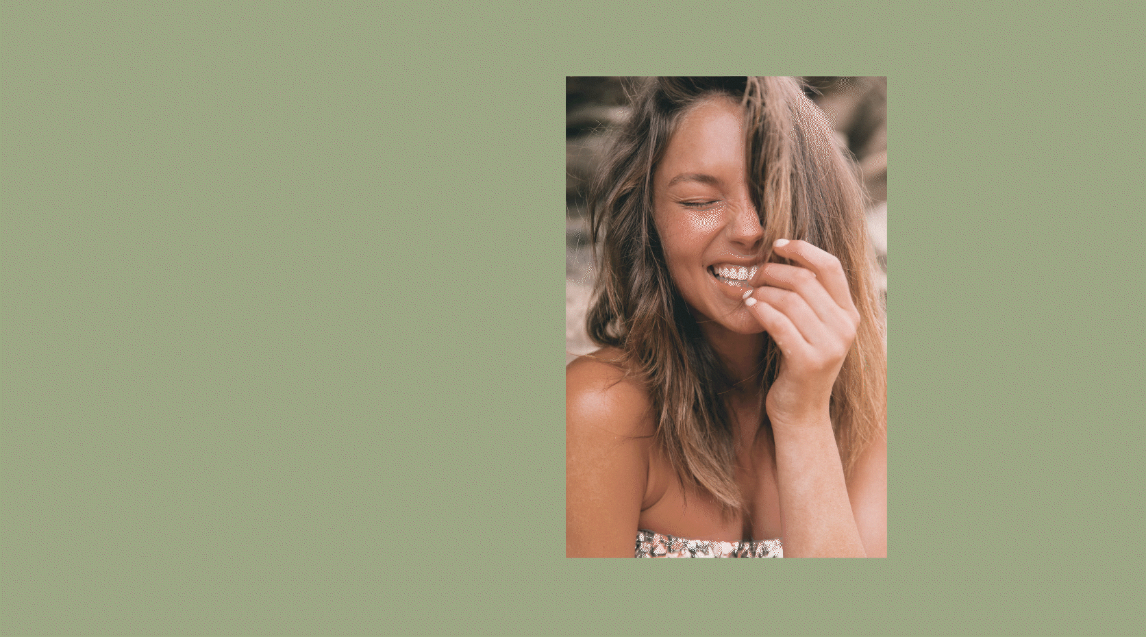
For the secondary images, I didn’t want them to subtract from the imagery.
When designing the website refresher of Sunseeker, I also wanted it to all flow together nicely, so incorporated organic shapes and used lifestyle imagery of the products where possible.
David Jones
Whenever working with the Ubran setting of David Jones stores, I like to have keep an ideology of “away from the city” in all of the advertising and marketing collateral I make.
As this campaign was predominately imagery-focused, keeping that in-mind, I wanted to have each piece of collateral work together as one. So through using salient imagery of our model, mixed with b-roll imagery of greenery I developed the final handover. Instagram was an all time high for society at that point, so it also plaid a huge part of inspiration. Through using similar-looking photography and scenes, I wanted to bring in the idea of ‘Stories’ and ‘Carousels’ into a real-life setting. It was to reflect the culture of not being able to pick which photo they look best in, so they upload them all. Even if it looks the same to others.


Iconography
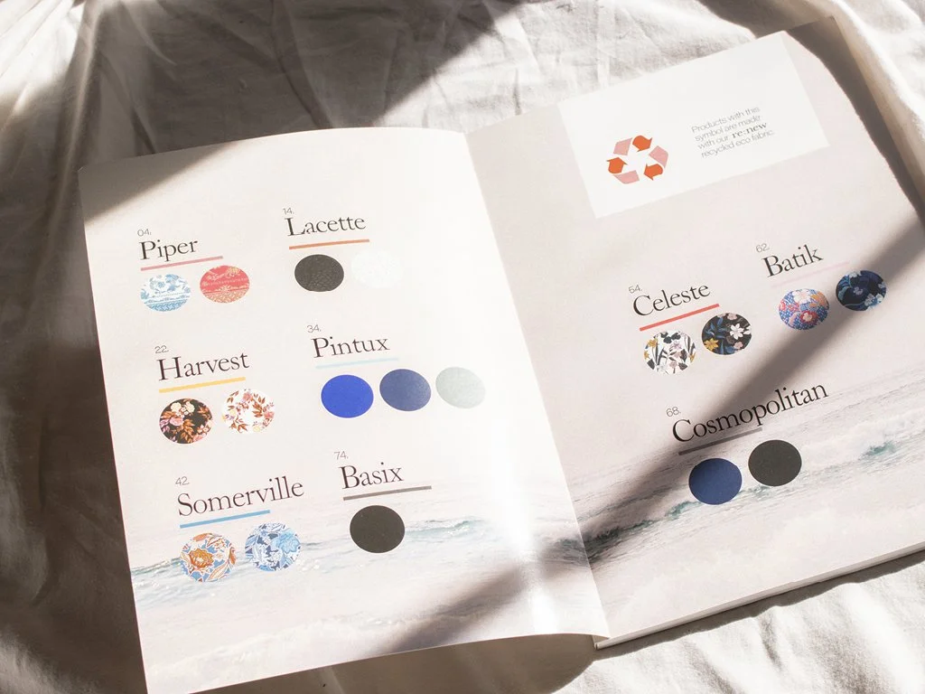
Used to display the swimsuits that contained recycled cotton and fishing nets.


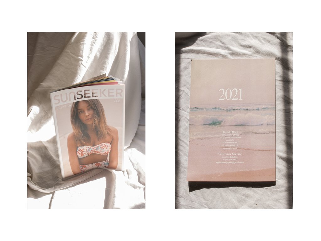
Digital treatment consisted of a re-fresh of the current Sunseeker website, and a new look and feel to their EDMs.


David Jones Installment


