Tranquil Insurance
Brand Identity, Brand Strategy, Design System & Promotional Ads
Strategy
Art Direction & Branding
Digital
-
Details coming soon

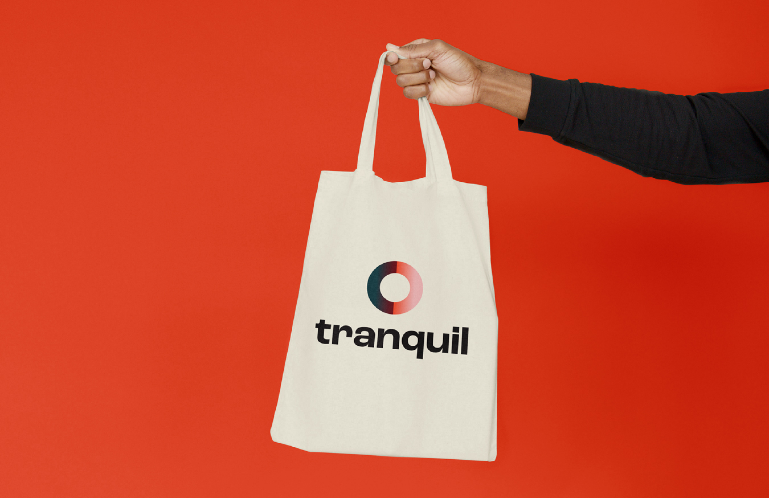
The design draws inspiration from Zen Gardens, which are known for evoking a sense of balance and harmony.
We also integrated the yin and yang concept, representing the complementary forces of nature, which directly connects with the theme of the Tranquil as a business.
Lastly, the geometric shape of the circle is used, symbolising peacefulness and completeness. Together, these elements aim to convey a message of serenity and equilibrium, reflecting the brand’s essence.

Secondary Elements
The circular and curvacious shapes are an integral part of the overall visual execution as it’s a representation of tranquility.
The pattern pulls from zen gardens and the lines drawn within sand.


Colours beyond tech
Color theory is crucial in visual identities as colors evoke emotions and convey meaning. They influence perception, brand recognition, and user experience. Strategic color selection creates visual harmony, communicates brand values, and helps establish a memorable and impactful brand presence.
Our choice of colour was selected based on this methodology focusing on evoking feelings of trust, innovation and authority.