Wulf & Bambi
Visual Identity & Branding
Grid
Motion Posters
Visual Identity
Social Media
Being passionate about interiors, home styling, and coordinating peaceful spaces, I created my own digital and physical prints brand named Wulf & Bambi.
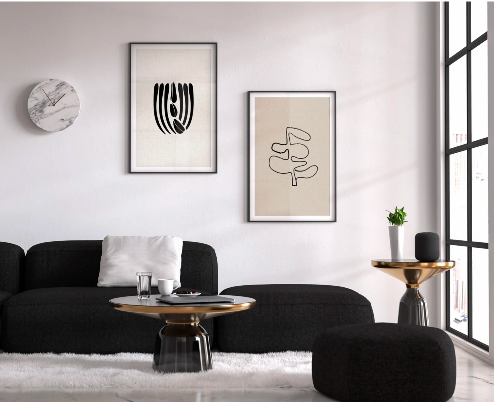
Wulf & Bambi creates high-quality artwork that can be printed on demand or on a home printer. Each download contains multiple sizes of prints with a range of lifelike textures. Ranging from linen, canvas, recycled paper, brown paper and more.
-
After creating the first few pieces for myself, I decided to dive into R&D. Topics included esty artworks that ranked well, most downloaded digital prints, vogue living, mid-century, japandi and contemporary artworks, high-end interiors and the philosophy of Kintsugi.
The logo was made by taking elements of the text type, and simplified into shapes. The colour choice was based on my own personal style and what I appreciate in design and interiors.
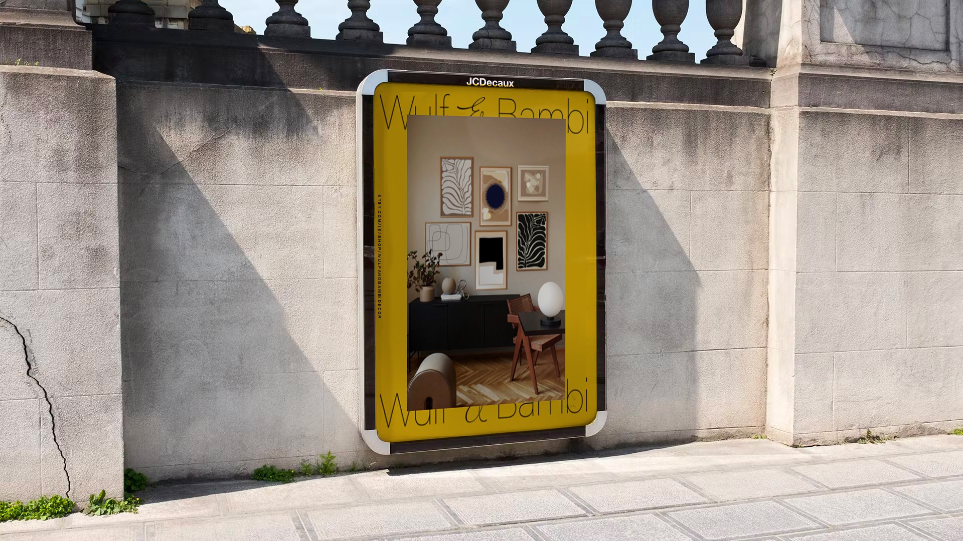
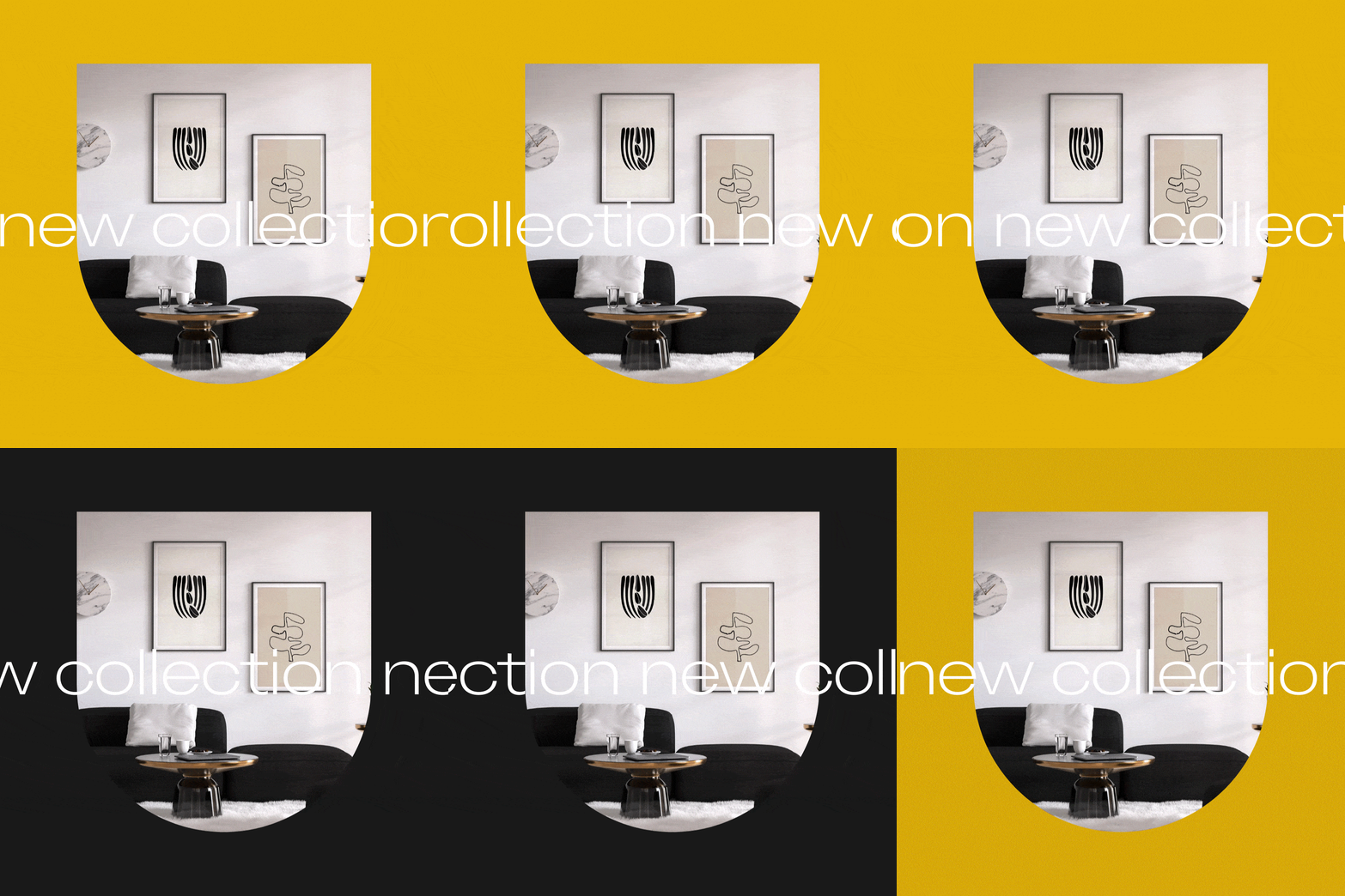
I wanted the brand design to be predominantly imagery based and the posters to be very grid-heavy, with elements breaking those rules respectfully. This was aimed to reflect contemporary art itself, as art breaks conventional rules.
The wordmark is a join of Sans Serif with Serif. This pays homage to the evolution of art and interiors. From the current Vogue serif, and new instagram stores popping up using mostly sans serifs. It is clean, classic and sophisticated.
As I had already decided on the wordmark first, I worked in reverseand simplified it to it’s basic shapes. The reason I decided to strip it back to basic shapes, was traditionally each sketch or painting of a salient subject is initally drawn first using basic shapes (shown below).
From this, I was able to make the visual language and secondary elements of geometric shapes (squares, rectangles, arches and circles).


